Back
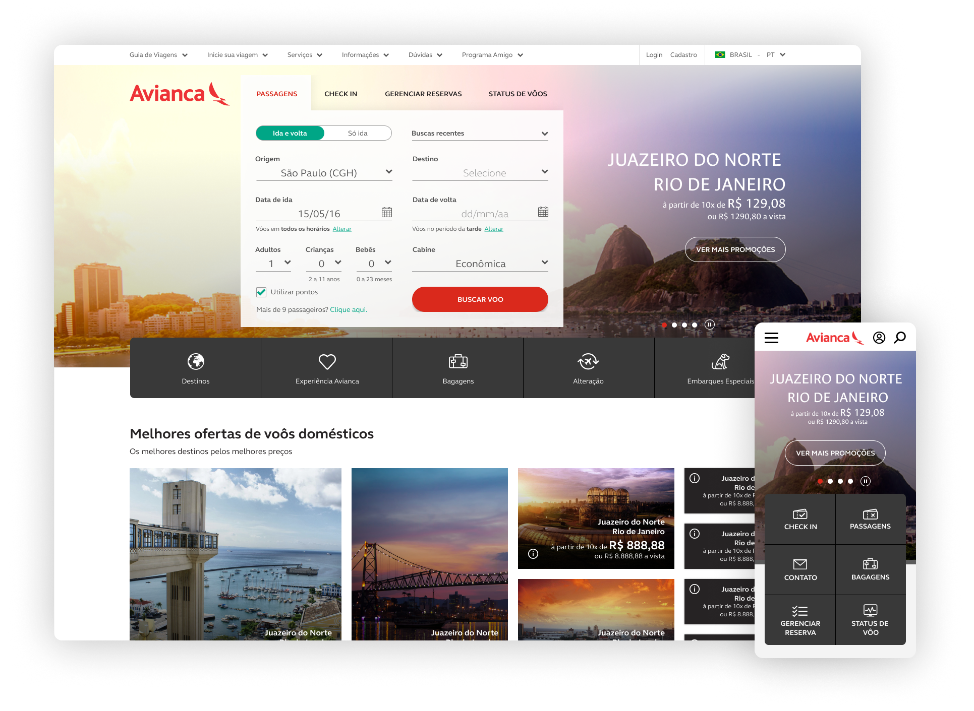
Avianca Brazil's website had the right content. None of it was in the right place. Check-in was buried. The booking engine competed with a dozen other elements for attention. Users who came to search a flight had to navigate a site designed around the airline, not around them.
Challenge
Our team at Accenture was brought in to fix the information architecture and modernize the visual identity. Internal research had already identified two distinct users: those searching for or buying a ticket, and those who already had one. Both landed on the same page. Neither was well served. Long disconnected flows and hidden links were the symptom. The real problem was that nobody had ever decided what the page was actually for.
Process
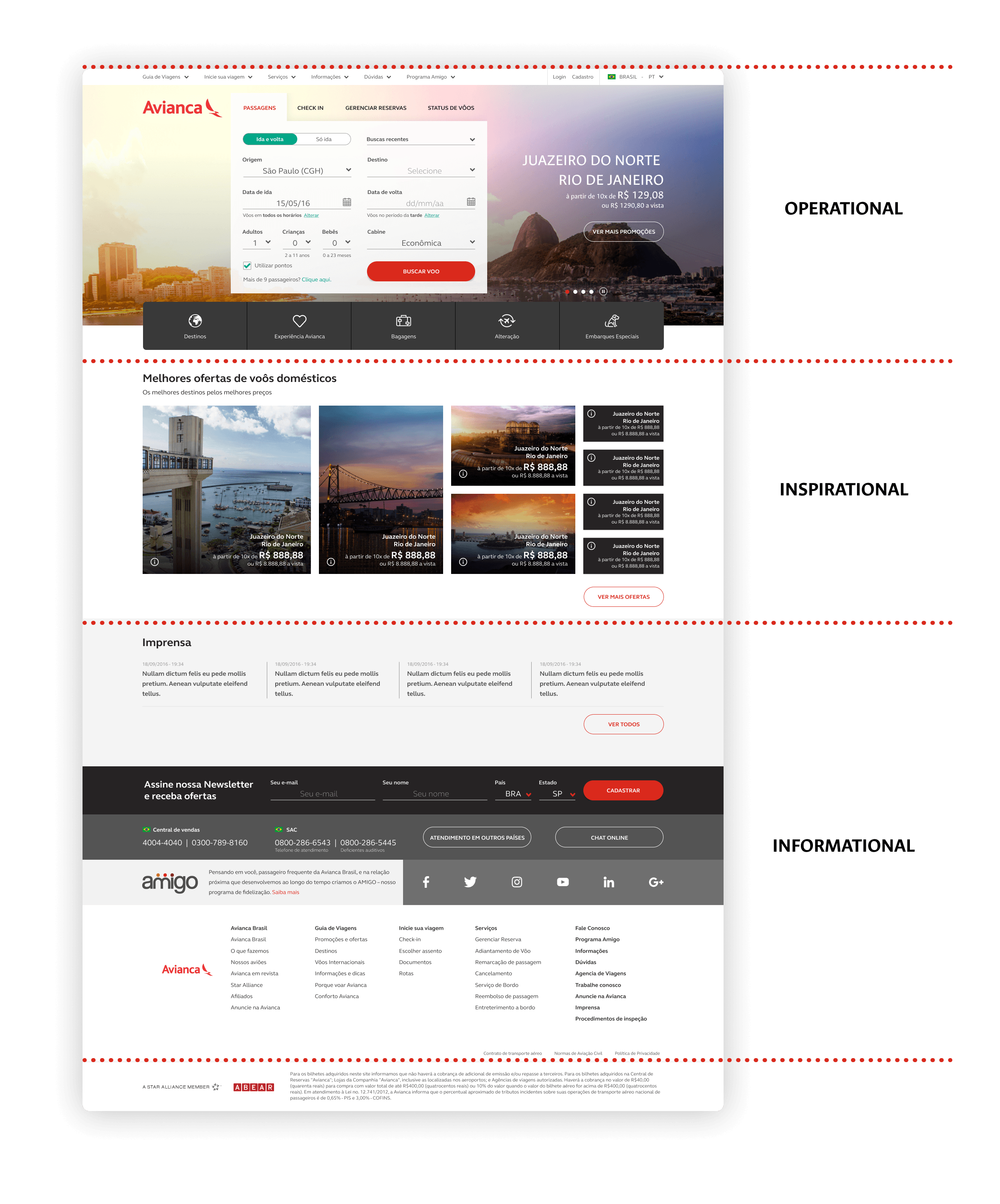
We rebuilt the home page around a three-layer hierarchy.
- The operational layer: the booking engine front and center, with a quick-access bar for check-in and the most-requested services.
- The inspirational layer, for users who weren't ready to act but wanted to browse destinations and find deals.
- The informational layer: news, company content, secondary links.
The order followed user intent. Most people came to do something. Some came to browse. Few came to read.
The client signed off without pushback. The logic held because it came from their own research, not from our preferences.
Responsive design wasn't technically feasible at the time, so we built two separate versions. Desktop and mobile each got their own structure, with the mobile version stripped down to the actions that mattered most when you're on the move. Silvio Senne built out the UI across every screen on top of the visual system we defined together.
Accessibility was built in from the start, not patched on at the end. The site shipped with WCAG-compliant contrast ratios, semantic element tagging, a skip navigation link for keyboard users, and a high-contrast version for users with visual impairments.
We validated the structure with usability tests before launch.
Result
The site launched in 2018 and stayed live for about three years. It was the first version of Avianca Brazil's digital presence that started from who the user was and what they needed, rather than from the company's content inventory.
Deliveries
- Information architecture redesign for a high-traffic airline website, built around two distinct user types
- Wireframes for desktop and mobile versions
- Full UI design for both platforms
- Usability testing with real users post-design